But when it comes to Android launchers, sometimes I wish it was more like iOS, where there was just one, non-customizable Springboard homescreen (gasp!). But this is Android, the land of the free. Anything under a bazillion options for replacing a particular feature would be disrespect to the droid. We’re not in iOS land, we’re in the Android world now. I’ve tried many launchers over the years, I’ve written countless articles about them (and I have a feeling this isn’t going be my last). Here’s what I’ve learned in my journey. This is the sum of my knowledge. This is how to pick the right launcher for you.
What Not to Do
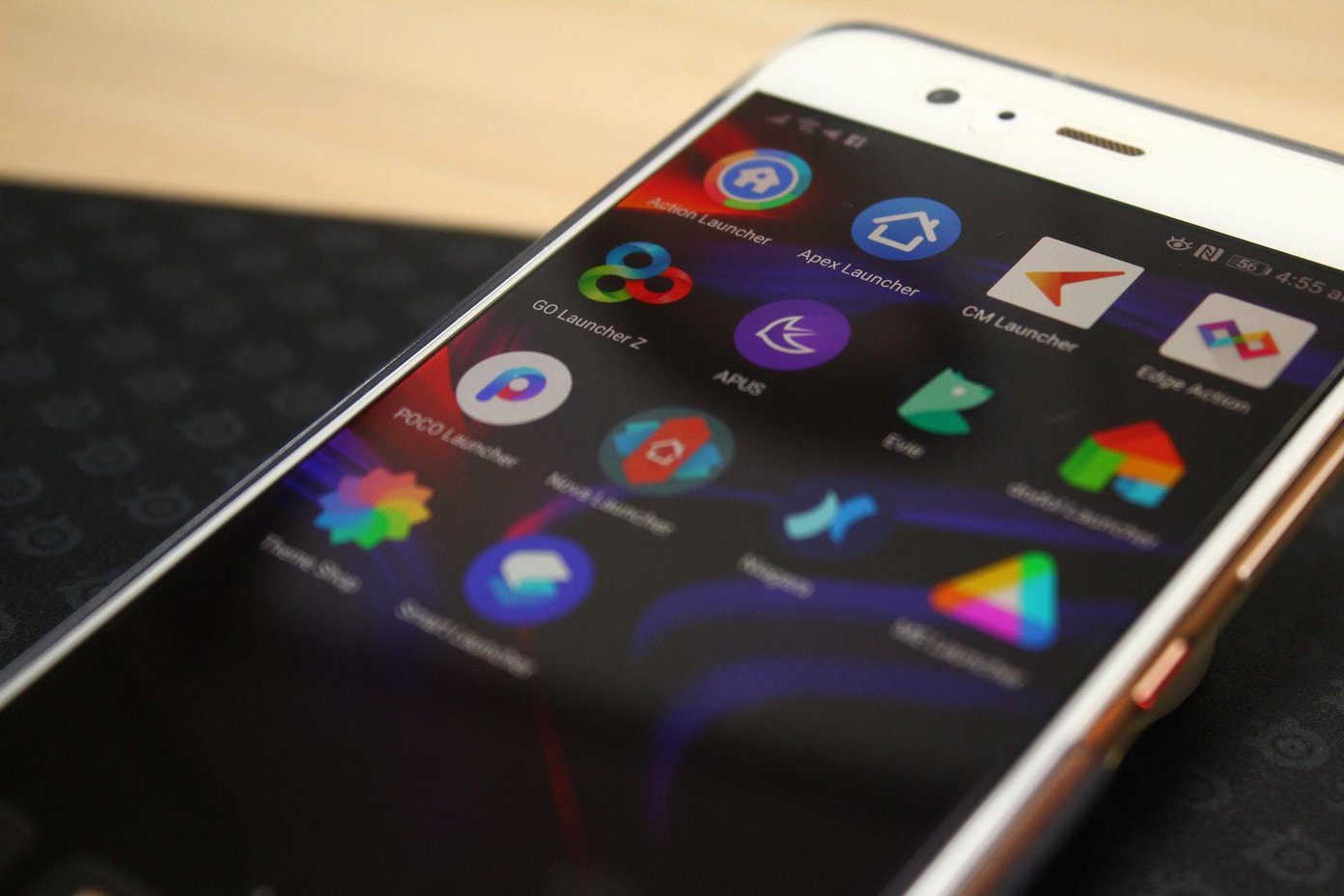
Before we get to the good stuff (and there is a lot of good stuff), first let’s talk about the no-nos. Stay away from any launcher that proudly advertises features that have nothing to do with making the process of launching apps faster/better. Apps that advertise how they’ll improve your phone’s performance (Boost!) or clear RAM (Turbo!) and make your phone faster should be off your list. Hola Launcher is a prime example. It’s not a very stable or well-written app. It will change all icons of the apps by default, and add shortcuts to other Hola branded apps you didn’t ask for. The app has a swipe down gesture but instead of putting the search field in focus and automatically bringing up the keyboard, it just shows a screen filled with semi-contextual stuff. It’s the same with Go Launcher. These are not well thought out apps. I’ve heard a lot about APUS launcher. You know how? I ended up at their Play Store page thanks to websites that have spammy pop-up ads that automatically open the app in the Play Store. If an app is using spam techniques to promote their app, they’re probably open to other not so moral activities when it comes to your personal information. Stay away from those apps (and this advice is not just limited to launchers). Apps like APUS, CM Launcher, Go Launcher Z, Hola and the likes are trying to create an ecosystem, not trying to create the best possible homescreen app. They have performance boosters, built-in app stores, suggessted apps, promotions, and ads. If you’re looking for all that, well and good. But most of us are not.
Simple and Basic: Google Now Launcher
If you’re not looking for anything fancy or smart but still want a well thought out launcher that integrates with Google Now and voice search (OK Google), just use Google’s own launcher. If you’re using a phone that comes with manufacturer’s often bloated launcher, switching to Now Launcher will give your phone a noticeable speed boost.
Simple Yet Powerful: EverythingMe
EverythingMe is my launcher of choice. Shockingly enough, it actually helps me make sense of the 200 apps I have installed and makes it easy for me to launch apps. First of all, the app generates smart folders for all the installed apps. It puts apps like Instagram, Pocket, Hangouts and more in properly labelled folders without me having to do anything (editing them is possible). EverythingMe has a really handy and fast search feature. Swiping down with one finger brings up the keyboard. Type anything – app, contact, songs and you’ll find it here. Believe it or not, it’s faster than Google’s own device search. The apps that I talked above – Go Launcher, APUS and more also support smart folders, but EverythingMe is much better at it.
For Contextual Information Addicts: Aviate, Buzz, Z Launcher
My mom loves Z Launcher from Nokia. She can’t get over how easy it is to just scribble the first letter of the app on the screen and have it right there. The app is in beta and it’s constantly improving (they finally added widget support). Z launcher will show contextual and most used apps on the homescreen. Aviate is another launcher from Yahoo that brings the power of contextual awareness to your homescreen. Depending the time of the day, and your usual activity, you’ll find that appropriate apps will just show up.
Beauty Matters: Themer and Buzz Launcher
I went through a phase where I manually themed my homescreen (yup). I’m over it now, but you might not be. If you’re more into looks and want your launcher to be unique and beautiful, you should check out Themer. They have thousands of awesome themes and it only takes a couple of seconds to apply them. Buzz Launcher is a similar option but it looks a bit too bloated to me.
Power User and Willing To Pay: Action Launcher 3 and Nova Prime
If you’re proud to call yourself an Android Geek/Power User and you don’t think paying for software is an absurd notion (I wish there were more people like you), drop $3.99 on Action Launcher 3 (via in-app purchases). It doesn’t have any BS features like Turbo Boost. It exists to serve only one purpose – to give you powerful features when it comes to launching apps. You’ll find super useful ways to launch apps that at first might seem weird. You’ll get options to tweak little things about the app drawer (sort by most used, remember last position) and the app has a useful spin on widgets. Just swipe up on an app’s icon to see the default widget. Action Launcher is famous for Quickdrawer that slides in from the left and lists all the apps. The paid version has a similar feature for widgets accessible from the right side of the screen. And the app has many more features. The video below talks about them in detail.
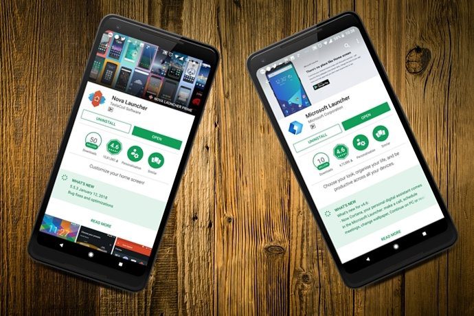
If I was writing this list a couple of years back, the top billing would be Nova Prime. Don’t get me wrong, the app is mighty powerful even today. But it’s too fiddly. If your idea of fun is spending an hour and a half messing with a launcher’s settings to customize it just the way you like it – have at it. Nova Prime adds powerful features like customizable gestures, hidden apps, swipeable dock and a lot more. But unlike Action Launcher, a lot of cool stuff in Nova is available in the free version. Speaking of which.
Power User on a Budget: Nova Launcher
The free version of Nova was the perfect launcher for 2011 me. And it might be for you too. Say you want to create custom layouts, disable app labels, change app icons and create a unique, beautiful homescreen on your own – well, Nova is the answer for you. The free version will let you do all of that and the app recently got a Material Design update and let me tell you, the app settings are much more intuitive now. Hello iOS Users: If you’re feeling left out, do not worry, and go through our article on customizing the iPhone’s Control Center.
What About You?
Now it’s your turn. If you’re an Android veteran I’m sure you have a war story or two when it comes to launchers. We all do. We’re all friends here. So grab a drink and meet me in the comments section below. The above article may contain affiliate links which help support Guiding Tech. However, it does not affect our editorial integrity. The content remains unbiased and authentic.


